Level Design Deep Dive


Hey guys, Kelly here! This week's deep dive will focus on my role of Design Lead, and particularly, my involvement in designing the levels for Mobility. As the Design Lead, it is my responsibility to ensure that the overall design is consistent and coherent across all areas, from the mechanics, UI, and sound design. The design must also “feel right” and align with the vision the team has for our game, which is constantly evolving as new ideas and improvements are made. I also need to make sure that all of that is conveyed to you, the player, in a way that allows you to play and enjoy our game to its full extent.
With Mobility being heavily reliant on its mechanics, I am most often in communication with Ronan, our Tech Lead and programmer. This is especially so as he builds and refines the levels from layouts that I design, which is something I have been working on for the past few weeks. Excluding the tutorial level and an anticipated level 2 created by Ronan and Melissa, respectively, I have mocked-up layouts for three levels and am currently working on the final one.
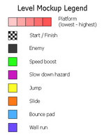
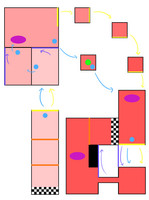
Featured here is the layout for the first level and a legend to explain the shapes and colour-coding I have used. As you can see, it is relatively short and simple as it is the level following immediately after the tutorial and should allow the player to start off easy. There are no enemies and minimal hazards, along with areas that enable the player to make their own choice in ability usage – do they want to use the bounce pad, wall run, or simply jump? There are also easy shortcuts that will introduce the player to this concept, as ways to achieve the fastest time will only become more challenging as the game progresses.
Level design has been a challenge in itself for me because there are so many things I need to take into consideration. Not only do I need to ensure each level is completable but are fun to play, making sure the layouts are fresh every time and that I’m not recycling too many elements. Additionally, I have to include and utilise the array of game mechanics in ways that highlight the unique aspects of Mobility that make it stand out from other speed-running games.
Because my layouts are entirely 2D, I don’t get to experience the level until they are put together. When that happens, I’ll actually play them and make any additional notes and feedback regarding things such as its difficulty, ease of navigation, and overall completability for Ronan to make adjustments to and polish to a standard the team will be happy with. Until then, I will continue working on the final level layout of our game and perhaps even some secret, bonus levels…?
Get Mobility
Mobility
| Status | In development |
| Author | Ugly Mirror Entertainment |
| Genre | Platformer, Shooter |
| Tags | 3D Platformer, Fast-Paced, Runner, Speedrun |
More posts
- Perth Games Festival PostmortemNov 27, 2022
- Perth Games FestivalNov 07, 2022
- Social MediaNov 02, 2022
- Final PolishNov 02, 2022
- Art and Consistent DesignOct 18, 2022
- Play Test Deep DiveOct 12, 2022
- Week 9 General UpdateOct 01, 2022
- UI Design Deep DiveOct 01, 2022
- Week 7 General UpdateSep 20, 2022
Leave a comment
Log in with itch.io to leave a comment.