Modelling Deep Dive
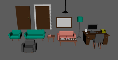
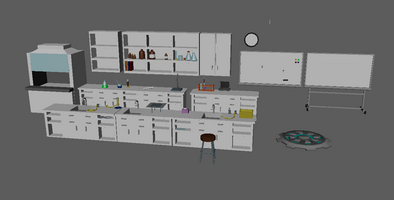
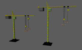
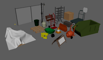
I’m Melissa, the art lead and it’s my turn to do the post this week. This weeks post is about the art of mobility. As art lead, my job is to make sure that the game looks consistent visually and that it fits with the theme of the game. Mobility is low poly with simple textures. In a game as fast paced as ours, stunning graphics would only slow the player down and prove distracting. Players need to know exactly where to go and where the limits exist to create the best path to the end for themselves.
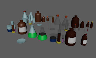
I’ve worked on mostly on modelling construction site, office, laboratory and street assets for our game. I chose to do these ones because they were things that I was familiar with and saw somewhat frequently in my day to day life, which makes them much easier to model. Though a few have been things I’ve had zero experience with. The latest addition to be modelled was a crane with variants for height as well as the trolley pulley cord lengths and rope lengths from the lifting hook block. These are required assets for one of the levels and need to be easily adjustable inside unity for level design purposes. the height of objects being a few centimetres out can make the difference between making the jump and seeming to hit an invisible wall. Which in a game like this can’t be happening.
Texturing meanwhile is relatively new to me so I’m very lucky to have a simple style to work with in this game. A lot of the lab models are objects that are made of glass, I at first had just given the empty sections a light blue colour to show that as the glass material. I later created a proper glass material that was transparent but It’s still undecided if it’ll be used in the game or not, but it’s not likely. While the glass material looks better it’s much harder to see from a distance and in a speed based game where players aren’t looking closely at small objects. it will probably be better sticking with materials that are easily seen and symbolise things like transparency instead or actually being so. It also matches the simpler art style better to not have certain aspects mimic real life more closely than others. So using a symbolic material would better match the other models found in the game. The models have been made to mix and match between levels. So the lab aspects especially won’t feel as bare and repetitive.
The levels are still being designed so new models not currently listed to be added may be needed as production continues. The most important part of the models though is that they are instantly recognisable so that players understand how to move forward in the game. They need to understand which items are helpful and which to avoid to get better scores. So for that to work everything must be consistent, hence my job as the art lead. So far we’ve had no issues with that and hopefully things will continue as such. Hopefully everyone will enjoy the art style of our game when it’s released.
Get Mobility
Mobility
| Status | In development |
| Author | Ugly Mirror Entertainment |
| Genre | Platformer, Shooter |
| Tags | 3D Platformer, Fast-Paced, Runner, Speedrun |
More posts
- Perth Games Festival PostmortemNov 27, 2022
- Perth Games FestivalNov 07, 2022
- Social MediaNov 02, 2022
- Final PolishNov 02, 2022
- Art and Consistent DesignOct 18, 2022
- Play Test Deep DiveOct 12, 2022
- Week 9 General UpdateOct 01, 2022
- UI Design Deep DiveOct 01, 2022
- Week 7 General UpdateSep 20, 2022
- Level Design Deep DiveSep 11, 2022
Leave a comment
Log in with itch.io to leave a comment.